Chapter 13 GIFs
This is the place where I put the stats gifs as I make them. The gifs can downloaded from this page, or they can be downloaded from this folder on the github repo for this book https://github.com/CrumpLab/statistics/tree/master/gifs. Please feel free to use them however you wish. The source code for compiling the gifs in R is shown alonside each gif. The animiations are made possible by the gganimate package.
This is a work in progress, subject to change and addition
13.1 Correlation GIFs
Note regression lines and confidence bands can be added using geom_smooth(method=lm, se=T)
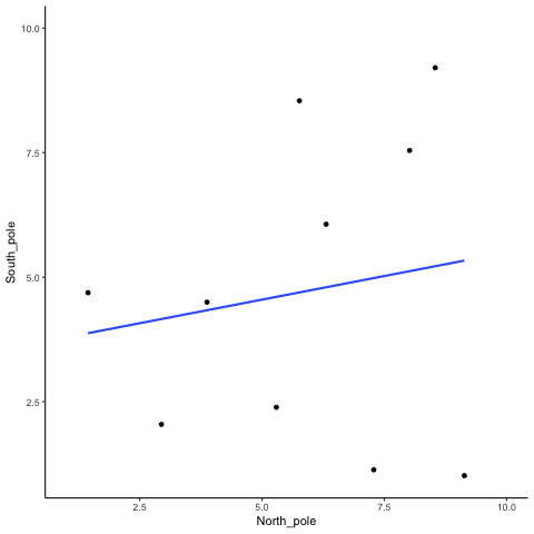
13.1.1 N=10, both variables drawn from a uniform distribution
all_df<-data.frame()
for(sim in 1:10){
North_pole <- runif(10,1,10)
South_pole <- runif(10,1,10)
t_df<-data.frame(simulation=rep(sim,10),
North_pole,
South_pole)
all_df<-rbind(all_df,t_df)
}
ggplot(all_df,aes(x=North_pole,y=South_pole))+
geom_point()+
geom_smooth(method=lm, se=FALSE)+
theme_classic()+
transition_states(
simulation,
transition_length = 2,
state_length = 1
)+enter_fade() +
exit_shrink() +
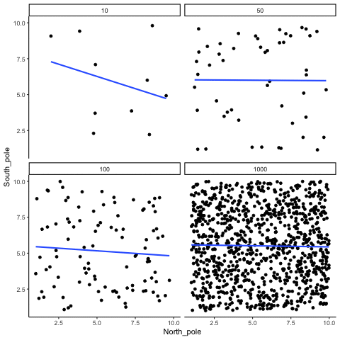
ease_aes('sine-in-out')13.1.2 Correlation between random deviates from uniform distribution across four sample sizes
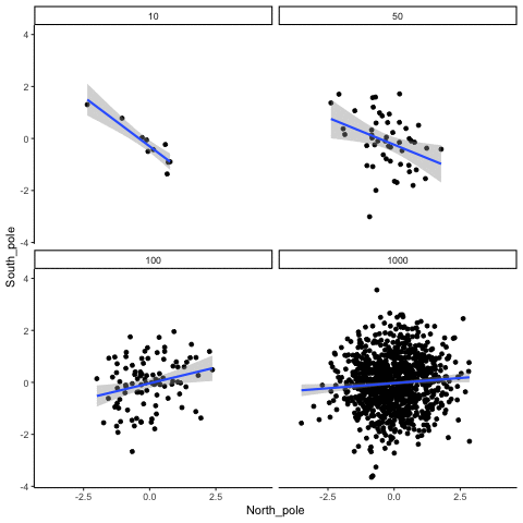
N= 10,50,100,1000 All values sampled from a uniform distribution
all_df<-data.frame()
for(sim in 1:10){
for(n in c(10,50,100,1000)){
North_pole <- runif(n,1,10)
South_pole <- runif(n,1,10)
t_df<-data.frame(nsize=rep(n,n),
simulation=rep(sim,n),
North_pole,
South_pole)
all_df<-rbind(all_df,t_df)
}
}
ggplot(all_df,aes(x=North_pole,y=South_pole))+
geom_point()+
geom_smooth(method=lm, se=FALSE)+
theme_classic()+
facet_wrap(~nsize)+
transition_states(
simulation,
transition_length = 2,
state_length = 1
)+enter_fade() +
exit_shrink() +
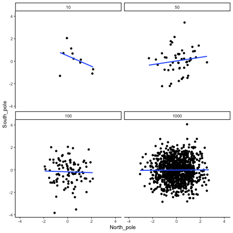
ease_aes('sine-in-out')13.1.3 Correlation between random deviates from normal distribution across four sample sizes
N= 10,50,100,1000 All values sampled from the same normal distribution (mean=0, sd=1)
all_df<-data.frame()
for(sim in 1:10){
for(n in c(10,50,100,1000)){
North_pole <- rnorm(n,0,1)
South_pole <- rnorm(n,0,1)
t_df<-data.frame(nsize=rep(n,n),
simulation=rep(sim,n),
North_pole,
South_pole)
all_df<-rbind(all_df,t_df)
}
}
ggplot(all_df,aes(x=North_pole,y=South_pole))+
geom_point()+
geom_smooth(method=lm, se=FALSE)+
theme_classic()+
facet_wrap(~nsize)+
transition_states(
simulation,
transition_length = 2,
state_length = 1
)+enter_fade() +
exit_shrink() +
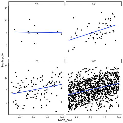
ease_aes('sine-in-out')13.1.4 Correlation between X and Y variables that have a true correlation as a function of sample-size
library(MASS)
r<-.7

proportional_permute<-function(x,prop){
  indices<-seq(1:length(x))
  s_indices<-sample(indices)
  n_shuffle<-round(length(x)*prop)
  switch<-sample(indices)
  x[s_indices[1:n_shuffle]]<-x[switch[1:n_shuffle]]
  return(x)
}

all_df<-data.frame()
for(sim in 1:10){
  for(samples in c(10,50,100,1000)){
    #data <- mvrnorm(n=samples, mu=c(0, 0), Sigma=matrix(c(1, r, r, 1), nrow=2), empirical=TRUE)
    #North_pole <- data[, 1]  # standard normal (mu=0, sd=1)
    #South_pole <- data[, 2]

    North_pole <- runif(samples,1,10)
    South_pole <- proportional_permute(North_pole,.5)+runif(samples,-5,5)

    t_df<-data.frame(nsize=rep(samples,samples),
                   simulation=rep(sim,samples),
                                  North_pole,
                                  South_pole)
  all_df<-rbind(all_df,t_df)
  }
}

ggplot(all_df,aes(x=North_pole,y=South_pole))+
  geom_point()+
  geom_smooth(method=lm, se=FALSE)+
  theme_classic()+
  facet_wrap(~nsize)+
  transition_states(
    simulation,
    transition_length = 2,
    state_length = 1
  )+enter_fade() +
  exit_shrink() +
  ease_aes('sine-in-out')
13.1.5 Type I errors, sampling random deviates from normal distribution with regression lines
These scatterplots only show what would be type I errors (assuming alpha=.05). The X and Y values were both sampled from the same normal distribution (mean = 0, sd=1). 1000 simulations were conducted for each sample size (10,50,100,1000). For each, the animiation shows 10 scatterplots where the observed “correlation” would have passed a significance test. According to definition, these correlations only arise from random normal deviates 5% of the time, but when they do arise for small sample sizes, they look fairly convincing.
all_df<-data.frame()
for(n in c(10,50,100,1000)){
  count_sims<-0
  for(sim in 1:1000){
    North_pole <- rnorm(n,0,1)
    South_pole <- rnorm(n,0,1)
    if(cor.test(North_pole,South_pole)$p.value<.05){
      count_sims<-count_sims+1
    t_df<-data.frame(nsize=rep(n,n),
                     simulation=rep(count_sims,n),
                     North_pole,
                     South_pole)
    all_df<-rbind(all_df,t_df)

    if(count_sims==10){
      break
    }
    }
  }
}


ggplot(all_df,aes(x=North_pole,y=South_pole))+
  geom_point()+
  geom_smooth(method=lm, se=TRUE)+
  theme_classic()+
  facet_wrap(~nsize)+
  transition_states(
    simulation,
    transition_length = 2,
    state_length = 1
  )+enter_fade() +
  exit_shrink() +
  ease_aes('sine-in-out')
13.1.6 Cell-size and correlation
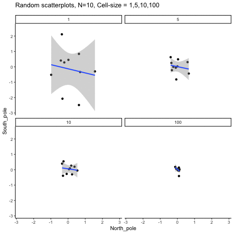
This simulation illustrates how the behavior of correlating two random normal samples as a function of cell-size. The sample-size is always set at N=10. For each panel, the simulation uses an increasing cell-size to estimate the mean for X and Y. When cell-size is 1, 10 X and Y values are drawn from the same normal (u=0, sd=1). When cell-size is 5, for each X,Y score in the plot, 5 samples were drawn from the same normal, and then the mean of the samples is plotted. The effect of cell-size shrinks the dot cloud, as both X and Y scores provide better estimates of the population mean = 0. Cell-size has no effect on the behavior of r, which swings around because sample-size N is small. These are all random, so there is always a 5% type I error rate (alpha =.05).
get_sampling_means<-function(m,sd,cell_size,s_size){
  save_means<-length(s_size)
  for(i in 1:s_size){
    save_means[i]<-mean(rnorm(cell_size,m,sd))
  }
  return(save_means)
}

all_df<-data.frame()
for(n in c(1,5,10,100)){
  count_sims<-0
  for(sim in 1:10){
    North_pole <- get_sampling_means(0,1,n,10)
    South_pole <- get_sampling_means(0,1,n,10)
      count_sims<-count_sims+1
      t_df<-data.frame(nsize=rep(n,10),
                       simulation=rep(count_sims,10),
                       North_pole,
                       South_pole)
      all_df<-rbind(all_df,t_df)
  }
}


ggplot(all_df,aes(x=North_pole,y=South_pole))+
  geom_point()+
  geom_smooth(method=lm, se=TRUE)+
  theme_classic()+
  facet_wrap(~nsize)+
  ggtitle("Random scatterplots, N=10, Cell-size = 1,5,10,100")+
  transition_states(
    simulation,
    transition_length = 2,
    state_length = 1
  )+enter_fade() +
  exit_shrink() +
  ease_aes('sine-in-out')
13.1.7 Regression
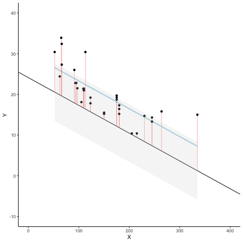
We look at how the residuals (error from points to line) behave as the regression lines moves above and below it’s true value. The total error associated with all of the red lines is represents by the grey area. This total error is smallest (minimized) when the black line overlaps with the blue regression line (the best fit line). The total error expands as the black line moves away from the regression. That’s why the regression line is the least wrong (best fit) line to skewer the data (according to least squares definition)
d <- mtcars
fit <- lm(mpg ~ hp, data = d)
d$predicted <- predict(fit)   # Save the predicted values
d$residuals <- residuals(fit) # Save the residual values

coefs<-coef(lm(mpg ~ hp, data = mtcars))
coefs[1]
coefs[2]

x<-d$hp
move_line<-c(seq(-6,6,.5),seq(6,-6,-.5))
total_error<-length(length(move_line))
cnt<-0
for(i in move_line){
  cnt<-cnt+1
  predicted_y <- coefs[2]*x + coefs[1]+i
  error_y <- (predicted_y-d$mpg)^2
  total_error[cnt]<-sqrt(sum(error_y)/32)
}

move_line_sims<-rep(move_line,each=32)
total_error_sims<-rep(total_error,each=32)
sims<-rep(1:50,each=32)

d<-d %>% slice(rep(row_number(), 50))

d<-cbind(d,sims,move_line_sims,total_error_sims)


anim<-ggplot(d, aes(x = hp, y = mpg, frame=sims)) +
  geom_smooth(method = "lm", se = FALSE, color = "lightblue") +
  geom_abline(intercept = 30.09886+move_line_sims, slope = -0.06822828)+
  lims(x = c(0,400), y = c(-10,40))+
  geom_segment(aes(xend = hp, yend = predicted+move_line_sims, color="red"), alpha = .5) +
  geom_point() +
  geom_ribbon(aes(ymin = predicted+move_line_sims - total_error_sims, ymax = predicted+move_line_sims + total_error_sims), fill = "lightgrey", alpha=.2)+
  theme_classic()+
  theme(legend.position="none")+
  xlab("X")+ylab("Y")+
  transition_manual(frames=sims)+
  enter_fade() +
  exit_fade()+
  ease_aes('sine-in-out')

animate(anim,fps=5)
13.2 Sampling distributions
13.2.1 Sampling from a uniform distribution
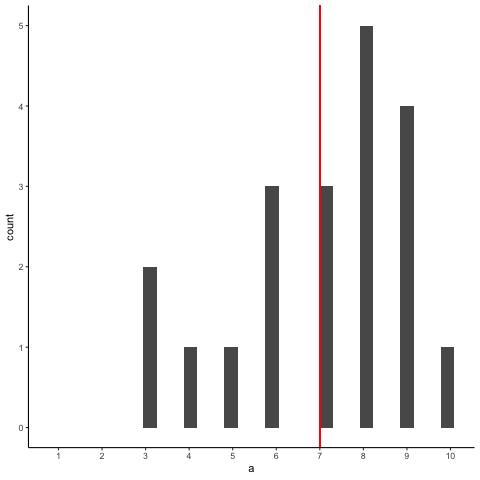
Animation shows histograms for N=20, sampled from a uniform distribution, along with mean (red line). Uniform distribution in this case is integer values from 1 to 10.
a<-round(runif(20*10,1,10))
df<-data.frame(a,sample=rep(1:10,each=20))
df2<-aggregate(a~sample,df,mean)
df<-cbind(df,mean_loc=rep(df2$a,each=20))

library(gganimate)

ggplot(df,aes(x=a, group=sample,frame=sample)) +
  geom_histogram() +
  geom_vline(aes(xintercept=mean_loc,frame = sample),color="red")+
  scale_x_continuous(breaks=seq(1,10,1))+
  theme_classic()+
  transition_states(
    sample,
    transition_length = 2,
    state_length = 1
  )+enter_fade() +
  exit_shrink() +
  ease_aes('sine-in-out')
13.2.2 Sampling from uniform with line showing expected value for each number
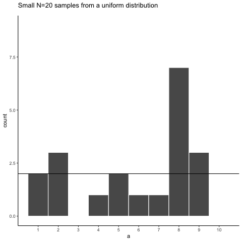
a<-round(runif(20*10,1,10))
df<-data.frame(a,sample=rep(1:10,each=20))


library(gganimate)
ggplot(df,aes(x=a))+
  geom_histogram(bins=10, color="white")+
  theme_classic()+
  scale_x_continuous(breaks=seq(1,10,1))+
  geom_hline(yintercept=2)+
  ggtitle("Small N=20 samples from a uniform distribution")+
  transition_states(
    sample,
    transition_length = 2,
    state_length = 1
  )+enter_fade() +
  exit_shrink() +
  ease_aes('sine-in-out')
13.2.3 Sampling distribution of the mean, Normal population distribution and sample histograms
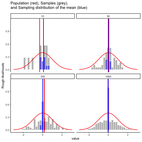
This animiation illustrates the relationship between a distribution (population), samples from the distribution, and the sampling distribution of the sample means, all as a function of n
Normal distribution in red. Individual sample histograms in grey. Vertical red line is mean of individual sample. Histograms for sampling distribution of the sample mean in blue. Vertical blue line is mean of the sampling distribution of the sample mean.
Note: for purposes of the animation (and because it was easier to do this way), the histograms for the sampling distribution of the sample means have different sizes. When sample-size = 10, the histogram shows 10 sample means. When sample size=100, the histogram shows 100 sample means. I could have simulated many more sample means (say 10000) for each, but then the histograms for the sample means would be static.
The y-axis is very rough. The heights of the histrograms and distributions were scaled to be in the same range for the animation.
get_sampling_means<-function(m,sd,s_size){
  save_means<-length(s_size)
  for(i in 1:s_size){
    save_means[i]<-mean(rnorm(s_size,m,sd))
  }
  return(save_means)
}

all_df<-data.frame()
for(sims in 1:10){
  for(n in c(10,50,100,1000)){
    sample<-rnorm(n,0,1)
    sample_means<-get_sampling_means(0,1,n)
    t_df<-data.frame(sims=rep(sims,n),
                     sample,
                     sample_means,
                     sample_size=rep(n,n),
                     sample_mean=rep(mean(sample),n),
                     sampling_mean=rep(mean(sample_means),n)
                     )
    all_df<-rbind(all_df,t_df)
  }
}


ggplot(all_df, aes(x=sample))+
  geom_histogram(aes(y=(..density..)/max(..density..)^.8),color="white",fill="grey")+
  geom_histogram(aes(x=sample_means,y=(..density..)/max(..density..)),fill="blue",color="white",alpha=.5)+
  stat_function(fun = dnorm,
                args = list(mean = 0, sd = 1),
                lwd = .75,
                col = 'red')+
  geom_vline(aes(xintercept=sample_mean,frame=sims),color="red")+
  geom_vline(aes(xintercept=sampling_mean,frame=sims),color="blue")+
  facet_wrap(~sample_size)+xlim(-3,3)+
  theme_classic()+ggtitle("Population (red), Samples (grey), \n and Sampling distribution of the mean (blue)")+ylab("Rough likelihoods")+
  xlab("value")+
  transition_states(
    sims,
    transition_length = 2,
    state_length = 1
  )+enter_fade() +
  exit_shrink() +
  ease_aes('sine-in-out')
13.2.4 Null and True effect samples and sampling means
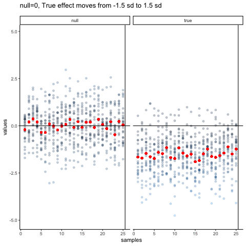
The null dots show 50 different samples, with the red dot as the mean for each sample. Null dots are all sampled from normal (u=0, sd=1). The true dots show 50 more samples, with red dots for their means. However, the mean of the true shifts between -1.5 and +1.5 standard deviations of 0. This illustrates how a true effect moves in and out of the null range.
all_df<-data.frame()
all_df_means<-data.frame()
dif_sim<-seq(-1.5,1.5,.25)
for(sim in 1:13){
  values<-c(rnorm(25*25,0,1),rnorm(25*25,dif_sim[sim],1))
  samples<-c(rep(seq(1:25),each=25),rep(seq(1:25),each=25))
  df<-data.frame(samples,values,sims=rep(sim,50*25),type=rep(c("null","true"),each=625))
  df_means<-aggregate(values~samples*type,df,mean, sims=rep(sim,50))
  all_df<-rbind(all_df,df)
  all_df_means<-rbind(all_df_means,df_means)
}

all_df<-cbind(all_df,means=rep(all_df_means$values,each=25))

ggplot(all_df,aes(y=values,x=samples))+
  geom_point(aes(color=abs(values)), alpha=.25)+
  geom_point(aes(y=means,x=samples),color="red")+
  theme_classic()+
  geom_vline(xintercept=25.5)+
  facet_wrap(~type)+
  geom_hline(yintercept=0)+
  theme(legend.position="none") +
  ggtitle("null=0, True effect moves from -1.5 sd to 1.5 sd")+
  transition_states(
    sims,
    transition_length = 2,
    state_length = 1
  )+enter_fade() +
  exit_shrink() +
  ease_aes('sine-in-out')
13.3 Statistical Inference
13.3.1 Randomization Test
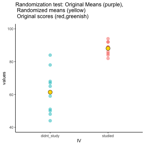
This is an attempt at visualizing a randomization test. Samples are taken under two conditions of the IV (A and B). At the beginning of the animation, the original scores in the first condition are shown as green dots on the left, and the original scores in the second condition are the red dots on the right. The means for each group are the purple dots. During the randomization, the original scores are shuffled randomly between the two conditions. After each shuffle, two new means are computed and displayed as the yellow dots. This occurs either for all permutations, or for a large random sample of them. The animation shows the original scores being shuffled around across the randomizations (the colored dots switch their original condition, appearing from side to side).
For intuitive inference, one might look at the range of motion of the yellow dots. This is how the mean difference between group 1 and group 2 behaves under randomization. It’s what chance can do. If the difference between the purple dots is well outside the range of motion of the yellow dots, then the mean difference observed in the beginning is not likely produced by chance.
study<-round(runif(10,80,100))
no_study<-round(runif(10,40,90))

study_df<-data.frame(student=seq(1:10),study,no_study)
mean_original<-data.frame(IV=c("studied","didnt_study"),
                          means=c(mean(study),mean(no_study)))
t_df<-data.frame(sims=rep(1,20),
                 IV=rep(c("studied","didnt_study"),each=10),
                 values=c(study,no_study),
                 rand_order=rep(c(0,1),each=10))

raw_df<-t_df
for(i in 2:10){
  new_index<-sample(1:20)
  t_df$values<-t_df$values[new_index]
  t_df$rand_order<-t_df$rand_order[new_index]
  t_df$sims<-rep(i,20)
  raw_df<-rbind(raw_df,t_df)
}

raw_df$rand_order<-as.factor(raw_df$rand_order)
rand_df<-aggregate(values~sims*IV,raw_df,mean)
names(rand_df)<-c("sims","IV","means")


a<-ggplot(raw_df,aes(x=IV,y=values,color=rand_order,size=3))+
  geom_point(stat="identity",alpha=.5)+
  geom_point(data=mean_original,aes(x=IV,y=means),stat="identity",shape=21,size=6,color="black",fill="mediumorchid2")+
  geom_point(data=rand_df,aes(x=IV,y=means),stat="identity",shape=21,size=6,color="black",fill="gold")+
  theme_classic(base_size = 15)+
  coord_cartesian(ylim=c(40, 100))+
  theme(legend.position="none") +
  ggtitle("Randomization test: Original Means (purple),
          \n Randomized means (yellow)
          \n Original scores (red,greenish)")+
  transition_states(
    sims,
    transition_length = 1,
    state_length = 2
  )+enter_fade() +
  exit_shrink() +
  ease_aes('sine-in-out')

animate(a,nframes=100,fps=5)
13.3.2 Independent t-test Null
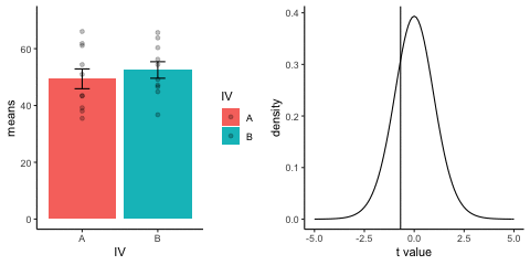
This is a simulation of the null distribution for an independent samples t-test, two groups, 10 observations per group.
This animation has two panels. The left panel shows means for group A and B, sampled from the same normal distribution (mu=50, sd =10). The dots represent individual scores for each of 10 observations per group.
The right panel shows a t-distribution (df=18) along with the observerd t-statistic for each simulation.
gganimate does not yet directly support multiple panels as shown in this gif. I hacked together these two gifs using the magick package. Apologies for the hackiness.
library(dplyr)
library(ggplot2)
library(magick)
library(gganimate)

A<-rnorm(100,50,10)
B<-rnorm(100,50,10)
DV <- c(A,B)
IV <- rep(c("A","B"),each=100)
sims <- rep(rep(1:10,each=10),2)
df<-data.frame(sims,IV,DV)

means_df <- df %>%
               group_by(sims,IV) %>%
               summarize(means=mean(DV),
                         sem = sd(DV)/sqrt(length(DV)))

stats_df <- df %>%
              group_by(sims) %>%
              summarize(ts = t.test(DV~IV,var.equal=TRUE)$statistic)

a<-ggplot(means_df, aes(x=IV,y=means, fill=IV))+
  geom_bar(stat="identity")+
  geom_point(data=df,aes(x=IV, y=DV), alpha=.25)+
  geom_errorbar(aes(ymin=means-sem, ymax=means+sem),width=.2)+
  theme_classic()+
  transition_states(
    states=sims,
    transition_length = 2,
    state_length = 1
  )+enter_fade() +
  exit_shrink() +
  ease_aes('sine-in-out')

a_gif<-animate(a, width = 240, height = 240)

b<-ggplot(stats_df,aes(x=ts))+
  geom_vline(aes(xintercept=ts, frame=sims))+
  geom_line(data=data.frame(x=seq(-5,5,.1),
                            y=dt(seq(-5,5,.1),df=18)),
            aes(x=x,y=y))+
  theme_classic()+
  ylab("density")+
  xlab("t value")+
  transition_states(
    states=sims,
    transition_length = 2,
    state_length = 1
  )+enter_fade() +
  exit_shrink() +
  ease_aes('sine-in-out')

b_gif<-animate(b, width = 240, height = 240)


d<-image_blank(240*2,240)

the_frame<-d
for(i in 2:100){
  the_frame<-c(the_frame,d)
}

a_mgif<-image_read(a_gif)
b_mgif<-image_read(b_gif)

new_gif<-image_append(c(a_mgif[1], b_mgif[1]))
for(i in 2:100){
  combined <- image_append(c(a_mgif[i], b_mgif[i]))
  new_gif<-c(new_gif,combined)
}

new_gif
13.3.3 Independent t-test True
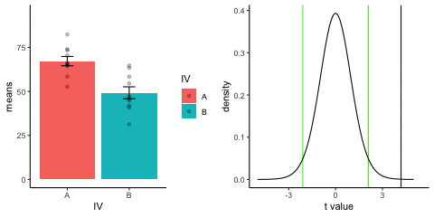
This is a simulation of an independent samples t-test, two groups, 10 observations per group, assuming a true difference of 2 standard deviations between groups
This animation has two panels. The left panel shows means for group A (normal, mu=50, sd=10) and B (normal, mu=70, sd=10). The dots represent individual scores for each of 10 observations per group.
The right panel shows a t-distribution (df=18) along with the observerd t-statistic for each simulation.
library(dplyr)
library(ggplot2)
library(magick)
library(gganimate)

A<-rnorm(100,70,10)
B<-rnorm(100,50,10)
DV <- c(A,B)
IV <- rep(c("A","B"),each=100)
sims <- rep(rep(1:10,each=10),2)
df<-data.frame(sims,IV,DV)

means_df <- df %>%
               group_by(sims,IV) %>%
               summarize(means=mean(DV),
                         sem = sd(DV)/sqrt(length(DV)))

stats_df <- df %>%
              group_by(sims) %>%
              summarize(ts = t.test(DV~IV,var.equal=TRUE)$statistic)

a<-ggplot(means_df, aes(x=IV,y=means, fill=IV))+
  geom_bar(stat="identity")+
  geom_point(data=df,aes(x=IV, y=DV), alpha=.25)+
  geom_errorbar(aes(ymin=means-sem, ymax=means+sem),width=.2)+
  theme_classic()+
  transition_states(
    states=sims,
    transition_length = 2,
    state_length = 1
  )+enter_fade() +
  exit_shrink() +
  ease_aes('sine-in-out')

a_gif<-animate(a, width = 240, height = 240)

b<-ggplot(stats_df,aes(x=ts))+
  geom_vline(aes(xintercept=ts, frame=sims))+
  geom_vline(xintercept=qt(c(.025, .975), df=18),color="green")+
  geom_line(data=data.frame(x=seq(-5,5,.1),
                            y=dt(seq(-5,5,.1),df=18)),
            aes(x=x,y=y))+
  theme_classic()+
  ylab("density")+
  xlab("t value")+
  transition_states(
    states=sims,
    transition_length = 2,
    state_length = 1
  )+enter_fade() +
  exit_shrink() +
  ease_aes('sine-in-out')

b_gif<-animate(b, width = 240, height = 240)


d<-image_blank(240*2,240)

the_frame<-d
for(i in 2:100){
  the_frame<-c(the_frame,d)
}

a_mgif<-image_read(a_gif)
b_mgif<-image_read(b_gif)

new_gif<-image_append(c(a_mgif[1], b_mgif[1]))
for(i in 2:100){
  combined <- image_append(c(a_mgif[i], b_mgif[i]))
  new_gif<-c(new_gif,combined)
}

new_gif
13.3.4 T-test True sample-size
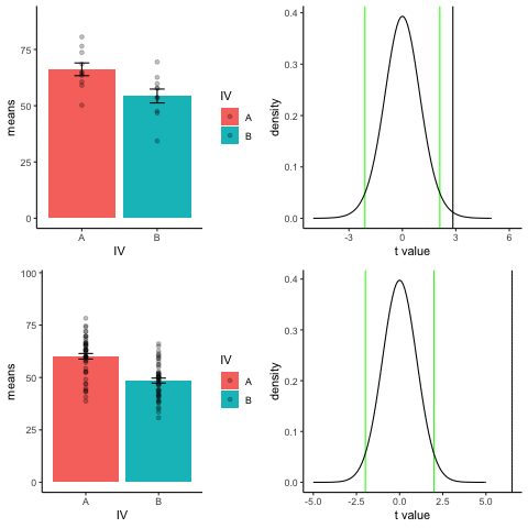
The top row shows 10 simulations of an independent sample t-test, with N=10, and true difference of 1 sd.
The bottom row shows 10 simulations with N=50.
The observed t-value occurs past the critical value (green) line much more reliably and often when sample size is larger than smaller.
library(dplyr)
library(ggplot2)
library(magick)
library(gganimate)
A<-rnorm(100,60,10)
B<-rnorm(100,50,10)
DV <- c(A,B)
IV <- rep(c("A","B"),each=100)
sims <- rep(rep(1:10,each=10),2)
df<-data.frame(sims,IV,DV)
means_df <- df %>%
group_by(sims,IV) %>%
summarize(means=mean(DV),
sem = sd(DV)/sqrt(length(DV)))
stats_df <- df %>%
group_by(sims) %>%
summarize(ts = t.test(DV~IV,var.equal=TRUE)$statistic)
a<-ggplot(means_df, aes(x=IV,y=means, fill=IV))+
geom_bar(stat="identity")+
geom_point(data=df,aes(x=IV, y=DV), alpha=.25)+
geom_errorbar(aes(ymin=means-sem, ymax=means+sem),width=.2)+
theme_classic()+
transition_states(
states=sims,
transition_length = 2,
state_length = 1
)+enter_fade() +
exit_shrink() +
ease_aes('sine-in-out')
a_gif<-animate(a, width = 240, height = 240)
b<-ggplot(stats_df,aes(x=ts))+
geom_vline(aes(xintercept=ts, frame=sims))+
geom_vline(xintercept=qt(c(.025, .975), df=18),color="green")+
geom_line(data=data.frame(x=seq(-5,5,.1),
y=dt(seq(-5,5,.1),df=18)),
aes(x=x,y=y))+
theme_classic()+
ylab("density")+
xlab("t value")+
transition_states(
states=sims,
transition_length = 2,
state_length = 1
)+enter_fade() +
exit_shrink() +
ease_aes('sine-in-out')
b_gif<-animate(b, width = 240, height = 240)
d<-image_blank(240*2,240)
the_frame<-d
for(i in 2:100){
the_frame<-c(the_frame,d)
}
a_mgif<-image_read(a_gif)
b_mgif<-image_read(b_gif)
new_gif<-image_append(c(a_mgif[1], b_mgif[1]))
for(i in 2:100){
combined <- image_append(c(a_mgif[i], b_mgif[i]))
new_gif<-c(new_gif,combined)
}
new_gif
## increase sample-size
A<-rnorm(50*10,60,10)
B<-rnorm(50*10,50,10)
DV <- c(A,B)
IV <- rep(c("A","B"),each=50*10)
sims <- rep(rep(1:10,each=50),2)
df<-data.frame(sims,IV,DV)
means_df <- df %>%
group_by(sims,IV) %>%
summarize(means=mean(DV),
sem = sd(DV)/sqrt(length(DV)))
stats_df <- df %>%
group_by(sims) %>%
summarize(ts = t.test(DV~IV,var.equal=TRUE)$statistic)
a<-ggplot(means_df, aes(x=IV,y=means, fill=IV))+
geom_bar(stat="identity")+
geom_point(data=df,aes(x=IV, y=DV), alpha=.25)+
geom_errorbar(aes(ymin=means-sem, ymax=means+sem),width=.2)+
theme_classic()+
transition_states(
states=sims,
transition_length = 2,
state_length = 1
)+enter_fade() +
exit_shrink() +
ease_aes('sine-in-out')
a_gif<-animate(a, width = 240, height = 240)
b<-ggplot(stats_df,aes(x=ts))+
geom_vline(aes(xintercept=ts, frame=sims))+
geom_vline(xintercept=qt(c(.025, .975), df=98),color="green")+
geom_line(data=data.frame(x=seq(-5,5,.1),
y=dt(seq(-5,5,.1),df=98)),
aes(x=x,y=y))+
theme_classic()+
ylab("density")+
xlab("t value")+
transition_states(
states=sims,
transition_length = 2,
state_length = 1
)+enter_fade() +
exit_shrink() +
ease_aes('sine-in-out')
b_gif<-animate(b, width = 240, height = 240)
d<-image_blank(240*2,240)
the_frame<-d
for(i in 2:100){
the_frame<-c(the_frame,d)
}
a_mgif<-image_read(a_gif)
b_mgif<-image_read(b_gif)
new_gif2<-image_append(c(a_mgif[1], b_mgif[1]))
for(i in 2:100){
combined <- image_append(c(a_mgif[i], b_mgif[i]))
new_gif2<-c(new_gif2,combined)
}
## add new row
final_gif <- image_append(c(new_gif[1], new_gif2[1]),stack=TRUE)
for(i in 2:100){
combined <- image_append(c(new_gif[i], new_gif2[i]),stack=TRUE)
final_gif<-c(final_gif,combined)
}
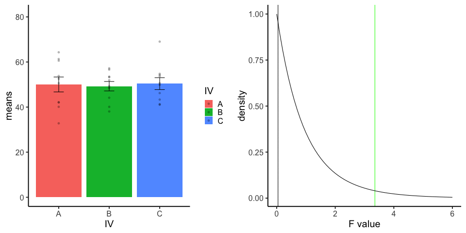
final_gif13.3.5 one-factor ANOVA Null
Three groups, N=10, all observations sampled from same normal distribution (mu=50, sd = 10)
library(dplyr)
library(ggplot2)
library(magick)
library(gganimate)
A<-rnorm(100,50,10)
B<-rnorm(100,50,10)
C<-rnorm(100,50,10)
DV <- c(A,B,C)
IV <- rep(rep(c("A","B","C"),each=10),10)
sims <- rep(1:10,each=30)
df<-data.frame(sims,IV,DV)
means_df <- df %>%
group_by(sims,IV) %>%
summarize(means=mean(DV),
sem = sd(DV)/sqrt(length(DV)))
stats_df <- df %>%
group_by(sims) %>%
summarize(Fs = summary(aov(DV~IV))[[1]][[4]][1])
a<-ggplot(means_df, aes(x=IV,y=means, fill=IV))+
geom_bar(stat="identity")+
geom_point(data=df,aes(x=IV, y=DV), alpha=.25)+
geom_errorbar(aes(ymin=means-sem, ymax=means+sem),width=.2)+
theme_classic(base_size = 20)+
transition_states(
states=sims,
transition_length = 2,
state_length = 1
)+enter_fade() +
exit_shrink() +
ease_aes('sine-in-out')
b<-ggplot(stats_df,aes(x=Fs))+
geom_vline(aes(xintercept=Fs))+
geom_vline(xintercept=qf(.95, df1=2,df2=27),color="green")+
geom_line(data=data.frame(x=seq(0,6,.1),
y=df(seq(0,6,.1),df1=2,df2=27)),
aes(x=x,y=y))+
theme_classic(base_size = 20)+
ylab("density")+
xlab("F value")+
transition_states(
states=sims,
transition_length = 2,
state_length = 1
)+enter_fade() +
exit_shrink() +
ease_aes('sine-in-out')
a_gif<-animate(a,width=480,height=480)
b_gif<-animate(b,width=480,height=480)
a_mgif<-image_read(a_gif)
b_mgif<-image_read(b_gif)
new_gif<-image_append(c(a_mgif[1], b_mgif[1]))
for(i in 2:100){
combined <- image_append(c(a_mgif[i], b_mgif[i]))
new_gif<-c(new_gif,combined)
}
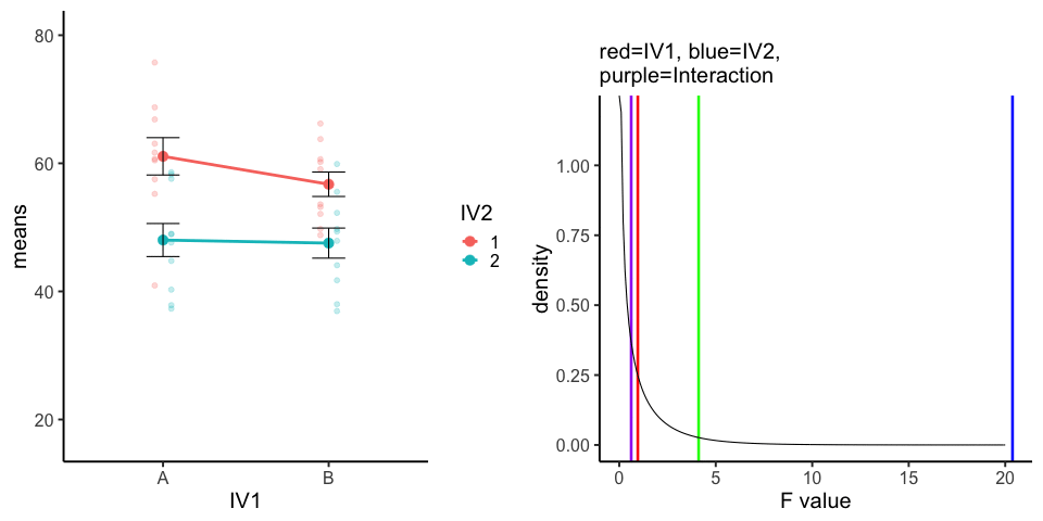
new_gif13.3.6 Factorial Null
10 simulations, N=10 in each of 4 conditions in a 2x2 (between-subjects). All observations taken from the same normal distribution (mu=50, sd =10).
A<-rnorm(100,50,10)
B<-rnorm(100,50,10)
C<-rnorm(100,50,10)
D<-rnorm(100,50,10)
DV <- c(A,B,C,D)
IV1 <- rep(c("A","B"),each=200)
IV2<-rep(rep(c("1","2"),each=100),2)
sims <- rep(1:10,40)
df<-data.frame(sims,IV1,IV2,DV)

means_df <- df %>%
  group_by(sims,IV1,IV2) %>%
  summarize(means=mean(DV),
            sem = sd(DV)/sqrt(length(DV)))

stats_df <- df %>%
  group_by(sims) %>%
  summarize(FIV1 = summary(aov(DV~IV1*IV2))[[1]][[4]][1],
            FIV2 = summary(aov(DV~IV1*IV2))[[1]][[4]][2],
            F1x2 = summary(aov(DV~IV1*IV2))[[1]][[4]][3]
            )

a<-ggplot(means_df, aes(x=IV1,y=means,
                                           group=IV2,
                                           color=IV2))+
  geom_point(data=df,aes(x=IV1, y=DV,group=IV2),
             position=position_dodge(width=.2),
             size=2,
             alpha=.25)+
  geom_point(size=4)+
  geom_line(size=1.3)+
  geom_errorbar(aes(ymin=means-sem, ymax=means+sem),width=.2,
                color="black")+
  theme_classic(base_size = 20)+
  transition_states(
    states=sims,
    transition_length = 2,
    state_length = 1
  )+enter_fade() +
  exit_shrink() +
  ease_aes('sine-in-out')

b<-ggplot(stats_df,aes(x=FIV1))+
  geom_vline(aes(xintercept=FIV1),color="red",size=1.2)+
  geom_vline(aes(xintercept=FIV2),color="blue",size=1.2)+
  geom_vline(aes(xintercept=F1x2),color="purple",size=1.2)+
  geom_vline(xintercept=qf(.95, df1=1,df2=36),color="green",size=1.2)+
  geom_line(data=data.frame(x=seq(0,20,.1),
                            y=df(seq(0,20,.1),df1=1,df2=36)),
            aes(x=x,y=y))+
  theme_classic(base_size = 20)+
  ylab("density")+
  xlab("F value")+
  ggtitle(label="",subtitle="red=IV1, blue=IV2, \n purple=Interaction")+
  transition_states(
    states=sims,
    transition_length = 2,
    state_length = 1
  )

a_gif<-animate(a,width=480,height=480)
b_gif<-animate(b,width=480,height=480)

a_mgif<-image_read(a_gif)
b_mgif<-image_read(b_gif)

new_gif<-image_append(c(a_mgif[1], b_mgif[1]))
for(i in 2:100){
  combined <- image_append(c(a_mgif[i], b_mgif[i]))
  new_gif<-c(new_gif,combined)
}

image_animate(new_gif, fps = 10,dispose="none")
13.4 Distributions
13.4.1 Normal changing mean
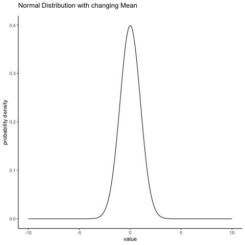
some_means<-c(0,1,2,3,4,5,4,3,2,1)
all_df<-data.frame()
for(i in 1:10){
  dnorm_vec <- dnorm(seq(-10,10,.1),mean=some_means[i],sd=1)
  x_range   <- seq(-10,10,.1)
  means <- rep(some_means[i], length(x_range))
  sims <- rep(i, length(x_range))
  t_df<-data.frame(sims,means,x_range,dnorm_vec)
  all_df<-rbind(all_df,t_df)
}

ggplot(all_df, aes(x=x_range,y=dnorm_vec))+
  geom_line()+
  theme_classic()+
  ylab("probability density")+
  xlab("value")+
  ggtitle("Normal Distribution with changing Mean")+
   transition_states(
    sims,
    transition_length = 1,
    state_length = 1
  )
  #enter_fade() +
  #exit_shrink() +
  #ease_aes('sine-in-out')
13.4.2 Normal changing sd
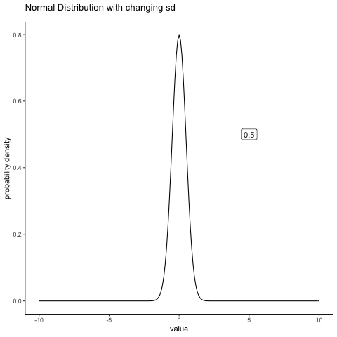
some_sds<-seq(0.5,5,.5)
all_df<-data.frame()
for(i in 1:10){
  dnorm_vec <- dnorm(seq(-10,10,.1),mean=0,sd=some_sds[i])
  x_range   <- seq(-10,10,.1)
  sds <- rep(some_sds[i], length(x_range))
  sims <- rep(i, length(x_range))
  t_df<-data.frame(sims,sds,x_range,dnorm_vec)
  all_df<-rbind(all_df,t_df)
}

labs_df<-data.frame(sims=1:10,
                    sds=as.character(seq(0.5,5,.5)))

ggplot(all_df, aes(x=x_range,y=dnorm_vec, frame=sims))+
  geom_line()+
  theme_classic()+
  ylab("probability density")+
  xlab("value")+
  ggtitle("Normal Distribution with changing sd")+
  geom_label(data = labs_df, aes(x = 5, y = .5, label = sds))+
   transition_states(
    sims,
    transition_length = 2,
    state_length = 1
  )+
  enter_fade() +
  exit_shrink() +
  ease_aes('sine-in-out')